Major UI Components
The user interface (UI) for the General Purpose Viewer(GPV) is divided into several panels.
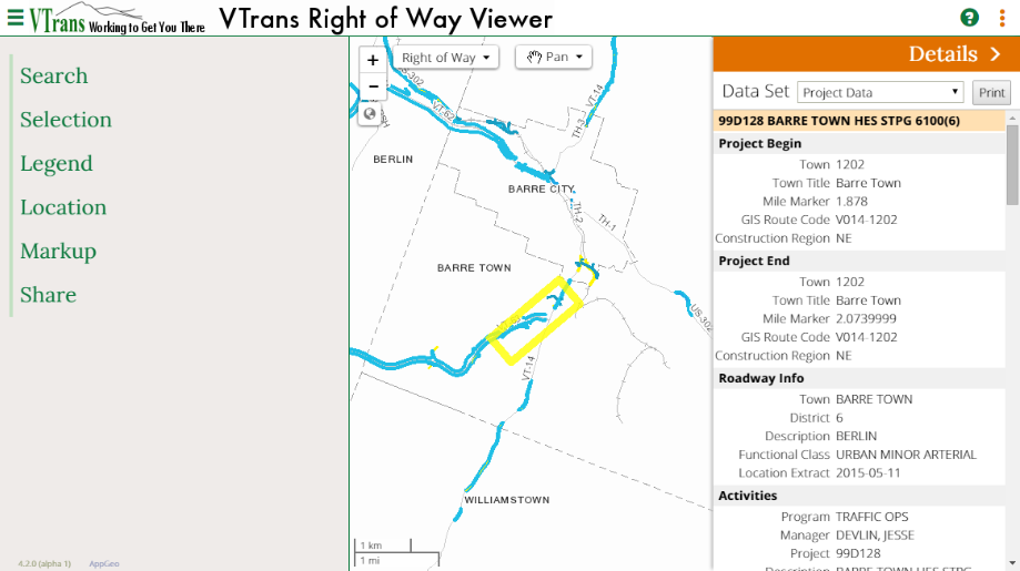
Map Panel: The GPV application will always have a Map Panel. This is the map itself and the basic controls needed to navigate, identify features, and change map themes. When the viewer is updating the map, an animated progress bar will appear at the top of the map panel.
Function Panel: To the left of Map Panel is the Function Panel which provides access to various GPV functions. Selecting a function from the menu will update the panel with additional features in the same panel. To return to the initial function menu click the < icon in the header.
Details Panel: The Details Panel will appear with more information about a feature when it is selected, either through the Selection Panel or using the identify tool. To hide the panel click the > icon in the header.
 |
Function Panel Toggle: Click to toggle the Function Panel in and out of the page. |
 |
Details Panel Toggle: Click to toggle the identify / selection Details Panel in and out of the page |
 |
Help: Click to get access to help documents. |
Function Panel Features
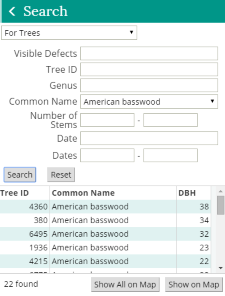 Search: There are two sections of the Search Panel. The top section
allows users to define their search criteria and the bottom section presents the results of the search.
Users can select one or more of the search results from the bottom section any see each on the map using
the “Show on Map” buttons. This visualization of search results will automatically open the Selection Panel
with the features selected from the search results. At any time users can navigate back to the Search panel
to continue searching for additional results, where the original search criteria and results will be preserved until reset.
Search: There are two sections of the Search Panel. The top section
allows users to define their search criteria and the bottom section presents the results of the search.
Users can select one or more of the search results from the bottom section any see each on the map using
the “Show on Map” buttons. This visualization of search results will automatically open the Selection Panel
with the features selected from the search results. At any time users can navigate back to the Search panel
to continue searching for additional results, where the original search criteria and results will be preserved until reset.
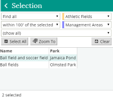 Selection: There are two sections of the Selection Panels. The top section
allows users to select features (mapped objects) from the map and bottom section presents information about
the selected features. The top panel contains drop down lists that control the selection of one or two map
layers and a filter for limiting the data shown. The bottom panel has one or more columns and shows detailed
data for the objects highlighted on the map.
Selection: There are two sections of the Selection Panels. The top section
allows users to select features (mapped objects) from the map and bottom section presents information about
the selected features. The top panel contains drop down lists that control the selection of one or two map
layers and a filter for limiting the data shown. The bottom panel has one or more columns and shows detailed
data for the objects highlighted on the map.
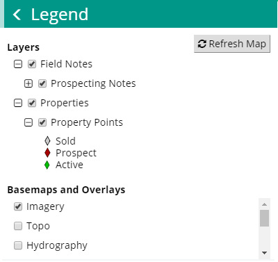 Legend Panel: The current application provides a panel which displays both the
legend for the current map and controls to manage additional basemap options. Depending on the GPV configuration,
parts of the legend may be expandable and collapsible and the basemap controls may be visible. Click check boxes
or radio buttons to turn thematic layers or basemaps on and off. The changes to the layers do not appear immediately
on the map, but changes to basemaps appear immediately. Click the Refresh Map button at the top of the legend to see
layer changes. Layer names that appear as a link are clickable and will open a window that contains more information
about that layer.
Legend Panel: The current application provides a panel which displays both the
legend for the current map and controls to manage additional basemap options. Depending on the GPV configuration,
parts of the legend may be expandable and collapsible and the basemap controls may be visible. Click check boxes
or radio buttons to turn thematic layers or basemaps on and off. The changes to the layers do not appear immediately
on the map, but changes to basemaps appear immediately. Click the Refresh Map button at the top of the legend to see
layer changes. Layer names that appear as a link are clickable and will open a window that contains more information
about that layer.
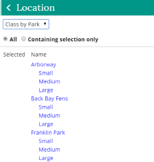 Location Panel: There are two sections of the Selection Panels. The top section
allows users to select features (mapped objects) from the map and bottom section presents information about the
selected features. The top panel contains drop down lists that control the selection of one or two map layers and a
filter for limiting the data shown. The bottom panel has one or more columns and shows detailed data for the
objects highlighted on the map.
Location Panel: There are two sections of the Selection Panels. The top section
allows users to select features (mapped objects) from the map and bottom section presents information about the
selected features. The top panel contains drop down lists that control the selection of one or two map layers and a
filter for limiting the data shown. The bottom panel has one or more columns and shows detailed data for the
objects highlighted on the map.
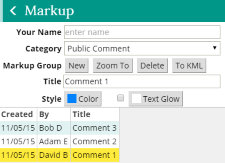 Markup Panel: The current application provides a panel for creating and managing
markups on the map. Groups of points, lines and polygons and text can be added to the map and saved in a database and can
later be retrieved and viewed by other users.
Markup Panel: The current application provides a panel for creating and managing
markups on the map. Groups of points, lines and polygons and text can be added to the map and saved in a database and can
later be retrieved and viewed by other users.
 Share Panel: The current application provides a panel for communicating the content
presented. There are a number of communication options including printing and electronic output formats. Additional
details about these features can be found in the Communicating with Others Section.
Share Panel: The current application provides a panel for communicating the content
presented. There are a number of communication options including printing and electronic output formats. Additional
details about these features can be found in the Communicating with Others Section.
The Search, Selection, Legend, Location, Markup, and Share Panels occupy the same space on the UI.
Interacting with the Map
 |
Zoom In/Out: Click the minus button to zoom in and the plus button to zoom out. |
 |
Full Map Extent: Click to zoom to the full extent of the map. |
 |
Zoom to Current Location: The map will re-center on the location provided by the browser or device. GPS must be enabled. |
 |
Overview Map: This will expand or contract the overview map. The highlighted box in the overview map shows the current map extent in relation to the full extent. This box can be dragged to change the map extent. |
 |
Map Theme: This drop down list contains a list of available map themes. The text will contain the name of the selected theme. Choose a new theme from the list to update the map. |
 |
Map Tools: By default the Pan tool is selected. The pan tool allows dragging of the map to change the current extent. Clicking on this will also expand the map tool menu. |
 |
Identify Tool: When this is selected, hover over a map feature will display a popup with information about that feature. Clicking on a feature will open the Details Panel with more information. The Details Panel contains a print button to print this information. *NOTE: Not all map features are identifiable. |
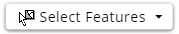 |
Select Features Tool: When this is selected click on features from the target or selection layers on the map. Either click features individually or drag a box to pick multiple features. Hold down on the Shift key while clicking or dragging to add features to the selected set. Hold down on the Control (Ctrl) key to remove features. |
 |
Draw Point: Click on the map to draw a small, circular point symbol. |
 |
Draw Line: Click on the map multiple times to draw a line with multiple vertices. Double-click to end the line. |
 |
Draw Polygon: Click on the map multiple times to draw a semi-transparent polygon. Double-click to end the polygon. |
 |
Draw Circle: Hold the mouse down on the map to define the center of a circle, drag to size the circle, and release to finish drawing the circle. Markup only. |
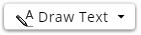 |
Draw Text: Click on the map to place text and show input box. Type text in input box. Press enter to complete the placement of text. To add a text glow with a background color, check the box next to the Text Glow color selector on the Markup Panel and select glow color prior to placing text on the map. |
 |
Draw Coordinates: Click on the map to draw a point with coordinates. |
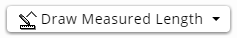 |
Draw Measured Length: Click on the map multiple times to draw a line with multiple vertices. Text showing the length of the line will display with the line. Double-click to end the line. |
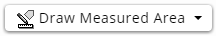 |
Draw Measured Area: Click on the map multiple times to draw a semi-transparent polygon. Text showing the area of the polygon will display inside the polygon. Double-click to end the polygon. |
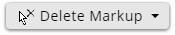 |
Delete Markup: Click on individual markup shapes and text to delete them. |
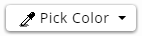 |
Pick Color: Click on a markup shape to set its color as the current drawing color. Markup only. |
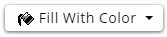 |
Fill With Color: Click on a markup shapes to change its color to the current drawing color. Markup only. |
Selecting Features on the Map
Features on the map from certain layers can be clicked to display information about them. Depending on how the GPV is configured and linked to other web applications, a set of selected features may be preset when the GPV opens - the functions on the Selection Panel allow for changing this selected set.
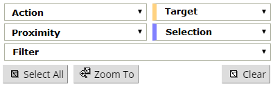 The top Selection Panel
specifies how to pick features on the map. This is done by setting the five pull down lists, to the right, so that together
a readable sentence is formed which describes how the Select Features map tool will function.
The top Selection Panel
specifies how to pick features on the map. This is done by setting the five pull down lists, to the right, so that together
a readable sentence is formed which describes how the Select Features map tool will function.
Action: Specify what the Select Feature map tool will do when the map is clicked. Three types of actions are supported:
- Select: Pick features directly from the Target layer.
- Find all [within a distance]: Pick features from the Selection layer and let the application find features on the Target layer within the distance specified by Proximity.
- Find the one...five [nearest]: Pick features from the Selection layer and let the application find the nearest features on the Target layer, regardless of their distance.
Target: Specifies the target layer. Data for features picked from this layer will be shown in the data grid below. Target features will highlight with the same color as the background of this pull down list (unless they have been filtered, in which case they will appear gray).
Proximity: "Find all" specifies the distance around features in the selection layer to search for features in the target layer. If set to zero, target features will only be found inside or directly adjacent to the selection features.
Selection: Will set the chosen selection layer. Features picked from this layer will be used to search for features in the target layer. Selection features will highlight with the same color as the background of this pull down list.
Filter: Applies a filter to the set of target features picked on the map. Data for features that fulfill the criteria of the filter will be displayed in the grid below this control.
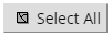 |
Select All in View: Select all features from the target or selection layers within the current view of the map. |
 |
Clear Selected Features: Clear the selected sets of target and selection features. |
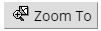 |
Zoom To Selected Features: (on the Map Panel) Zoom to the combined extent of all target and selection features. |
Using Selected Features
If the Selection Function is available in the GPV application instance and a feature has been selected on the map, the capabilities below can be used to show data about those features.
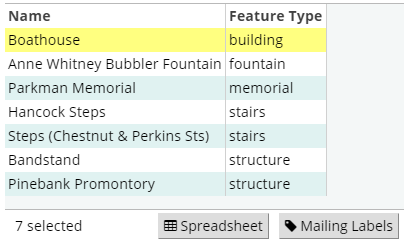 Data Grid: This displays data about the selected target features that have passed the filter criteria.
The columns of data shown will vary with the target layer and the selected filter. Clicking on a row in this grid will highlight that row,
highlight the corresponding feature on the map, and bring up detailed data in the Details Panel on the right side of the UI.
Double-clicking will do the same plus zoom to the feature. The total number of rows in the grid is displayed at the lower left of the grid.
Data Grid: This displays data about the selected target features that have passed the filter criteria.
The columns of data shown will vary with the target layer and the selected filter. Clicking on a row in this grid will highlight that row,
highlight the corresponding feature on the map, and bring up detailed data in the Details Panel on the right side of the UI.
Double-clicking will do the same plus zoom to the feature. The total number of rows in the grid is displayed at the lower left of the grid.
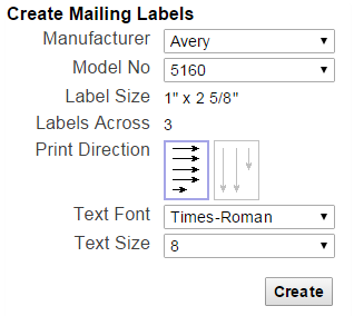 To Mailing Labels: When enabled, this allows for the generation of mailing labels for the selected target features.
A window will pop up with options for setting label format, printing direction and font characteristics. The labels are delivered as a PDF file which
can be printed or saved to disk. It is likely that only certain layers (such as parcels or buildings) will be enabled for mailing labels in
the application.
To Mailing Labels: When enabled, this allows for the generation of mailing labels for the selected target features.
A window will pop up with options for setting label format, printing direction and font characteristics. The labels are delivered as a PDF file which
can be printed or saved to disk. It is likely that only certain layers (such as parcels or buildings) will be enabled for mailing labels in
the application.
To Spreadsheet: This exports the data for the selected target features currently shown in the data grid to a comma-separated value (CSV) file or an Excel spreadsheet (XLS) depending on the configuration of this application. This may launch a program, such as Microsoft Excel or OpenOffice Calc, for viewing the spreadsheet. If not, a prompt will appear to save the file to disk. NOTE: Later versions of Excel may display a notice regarding the XLS file format. This can be safely ignored and the file can be opened.
Details Panel: The Panel opens from the left side of the UI and shows detailed data from the feature highlighted in the selection data grid. Depending on the application, one or more data set options will be available in the dropdown list for different types of data. Some of the data shown in the panel may be displayed as links to other pages (which will popup in another window) or which change the target layer, selection layer, and selected features. It is also possible to have small images within the listed data. These may be links to other pages or documents. Next to the data set dropdown is a button that allows for printing the data shown in the Details Panel.
Creating and Managing Map Markup
 Drawn shapes and text (markup) can be added to the map for others to
see. Everyone has the ability to edit and delete the markup created by any users. Given the wide-open nature of this environment,
organizations may set guidelines for the proper treatment of markup. Please contact your administrator for details.
Drawn shapes and text (markup) can be added to the map for others to
see. Everyone has the ability to edit and delete the markup created by any users. Given the wide-open nature of this environment,
organizations may set guidelines for the proper treatment of markup. Please contact your administrator for details.
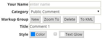
Your Name: A name or identifier must be provided to create markup. This name will appear in the grid below for all markup created.
Category: Markup is placed in categories for ease of management. Select an appropriate category from this list before creating new markup. Upon selecting a category the grid will update to show all available markup groups in that category.
Markup Group: Shapes and text that created are stored in named groups. The following functions help manage these markup groups.
- New: Creates a new, untitled markup group in the selected category assigned to your name. Once clicked the tools relating to markup in the Map Tools list above are available to create the markup graphics.
- Zoom To: Zooms the map to the extent of all the shapes and text in the current markup group. Use this return to the markup group if the map extent has changed.
- Delete: Deletes the current markup group. The markup will be removed from the map and grid.
- To KML: Exports the current markup group to a file which can be displayed in Google Earth.
Title: The title of the current markup group. This defaults to [untitled] for new markup groups. Change this to a short phase which accurately describes the markup group.
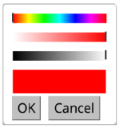 Style: Style colors can be applied separately to both new markup and new text glow color by clicking on the
respective buttons in the Markup Panel. A color Selection Panel will display the hue, saturation and value of the current color. Move the sliders to change
any of these color properties then click OK to set this as the new color.
Style: Style colors can be applied separately to both new markup and new text glow color by clicking on the
respective buttons in the Markup Panel. A color Selection Panel will display the hue, saturation and value of the current color. Move the sliders to change
any of these color properties then click OK to set this as the new color.
Sharing Maps
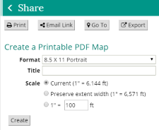
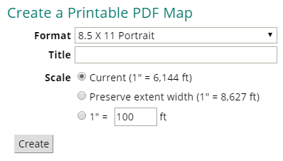 Print: Displays a utility for
creating a PDF version of the current map suitable for printing or archiving. Options can be set to select page layout and
preservation of either the scale or the width of the current map. Depending on the configuration, options may be enabled to provide text,
such as a title and/or notes, which will appear in specific locations on the printable page.
Print: Displays a utility for
creating a PDF version of the current map suitable for printing or archiving. Options can be set to select page layout and
preservation of either the scale or the width of the current map. Depending on the configuration, options may be enabled to provide text,
such as a title and/or notes, which will appear in specific locations on the printable page.
Other Capabilities
Mobile: When the application is launched from a mobile phone, a responsive mobile version is presented. This mobile version has a limited subset of features; users of the mobile version can only perform basic map navigation, identify key features, change the map theme, and zoom to their current location.